Do
- Keep natural firelight and original color.
- Crop out Instagram UI without reconstructing pixels.
- Show hands, heat, sourcing and the table.
- Use portrait photography as a deliberate editorial device.
- Choose mobile crops that keep the subject intact.
KAEN Manila
A digital identity system derived from the restaurant’s observed visual language and the photographs supplied for this pitch.
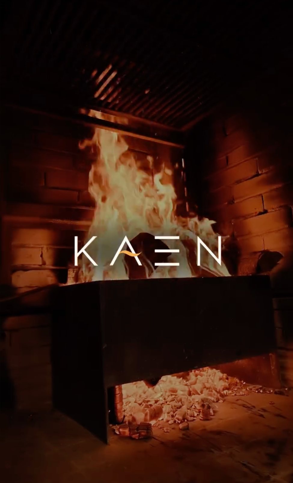
KAEN is not a generic steakhouse identity. Fire is the cooking language; produce, people and provenance are the story.
Near-black environments, warm firelight, a narrow geometric wordmark, restrained composition, close food detail, hands at work, smoke, wood, natural textures and a sense of intimacy.
An editorial, image-led web system that uses dark space as structure, warm bronze/orange as controlled accents, large photography, thin rules and almost no decorative UI.
The palette follows the room and the fire rather than introducing an unrelated “luxury” color scheme.
Produce, people,
and the honesty of fire.
Editorial display — Cormorant Garamond
Large storytelling moments, quotes, section titles. It adds literary warmth against KAEN’s geometric mark without trying to imitate the official logo.
FIRE · PRODUCE · PEOPLE / RESERVE A TABLE / 6109 ALBERT STREET
Interface — Manrope
Navigation, metadata, forms and operational information. Keep it compact, precise and quiet.
KAEN
Pitch wordmark treatment — Montserrat Light with wide tracking.
Production must replace this with the client-supplied official KAEN vector mark.
No AI-generated food or restaurant imagery. Use real cooking, dishes, people and material texture. Let the image carry emotion; UI should get out of the way.


The interface should feel like moving through a dining room: quiet entrance, clear rhythm, strong moments of heat, then space again.
Motion: slow reveal, subtle vertical movement, no autoplay carousels, no bouncing CTA treatments. Reduced-motion users should receive a fully static experience.
Sensory and precise. Ingredient-first. Confident without sounding ceremonial.
| Use | fire, source, catch, produce, share, char, tide, table, grower, craft |
|---|---|
| Avoid | world-class, best-ever, mouthwatering, elevated, luxurious, premium (unless operationally necessary) |
“The menu changes with what arrives. Order for the table and follow the fire.”
Before launch, replace pitch treatments with the restaurant’s official logo files, original high-resolution photography, approved current menu data, confirmed reservation workflow, accessibility details, privacy copy, analytics and client-approved structured data.
This brandbook distinguishes observed brand signals from proposed digital execution. Nothing here should be represented as KAEN’s pre-existing official brand manual without client approval.